![]()
British Fencing has launched a dynamic new brand identity and visual style ahead of the opening ceremony of RIO2016, created by London Brand Communications agency We Launch.
In readiness for the increased exposure that the 2016 Olympic Games in Rio would bring, the brief was to revolutionise the sport of fencing in the UK – in a way that would completely reinvent its public perception and broaden its appeal to a wide range of audiences.
Fencing is a sport with centuries of history – dating back to when Kings and nobility used to duel for honour, and yet requires all of the skills more usually associated with the high velocity Olympic sports: speed, strength, dynamism and power. But more than that, it also rewards those with guile, strategy, grace, creativity and speed of thought.
Research highlighted that audiences (participants and fans) predominantly fell across two areas – tactical gamers and creatives. Both are attracted to the sport for different reasons, so We Launch created a set of multi-channel brand collateral that unified the core themes and celebrated the individuality and empowerment that is intrinsic to the sport.
GEORGINA USHER/CEO, BRITISH FENCING:
“With Rio 2016 approaching there was an opportunity to challenge a whole new audience to think differently about Fencing. The sport dares people to be different and celebrates individualism. It engages and empowers many types of individual, be that a creative person, a tactical ‘gamer’, or someone that simply wants to win a swordfight. People are finding more and more ways to get involved in fencing, and we wanted the new brand to reflect the universal excitement of picking up a sword and challenging someone to a duel. At the same time, we needed to retain the values of honesty, respect and excellence.
From the moment that we met, the team at We Launch displayed the passion for the sport and had a portfolio of work that made them the natural choice. They immersed themselves in the sport, really understanding the brief and the audience, whilst being extremely flexible and accommodating in the way that they worked with us – constantly going the extra mile to achieve the best results.
We are very excited about the results so far and are looking forward to bringing the brand to life even further over the coming months.”
STUART LANG/CREATIVE DIRECTOR, WE LAUNCH:
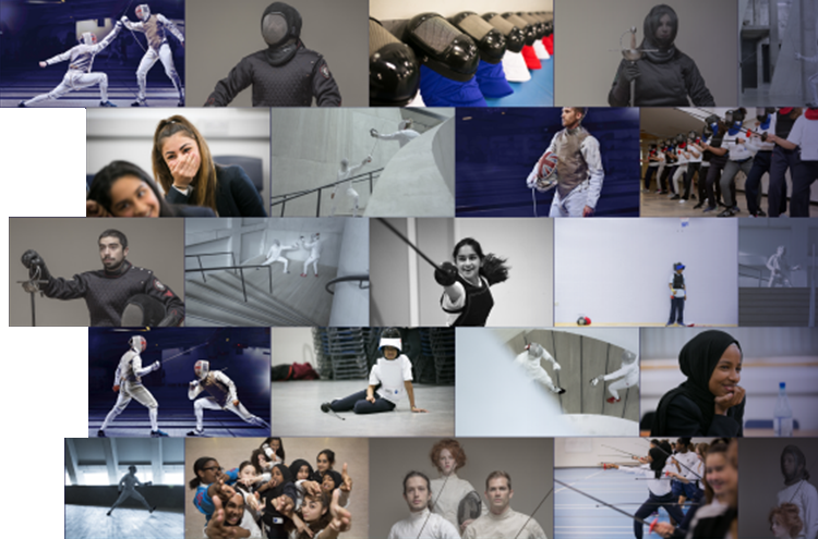
“Our solution was the embodiment of precision and sharpness. The simplicity of the idea allowed for the three swords ‘slashes’ to slice through the logotype – which became the unique icon that would be immediately recognisable as the symbol for British Fencing. The logo and visual style are perfectly aligned, with dramatic angular shapes (graphically depicting the movement of the three fencing weapons) cutting through the imagery and messaging.
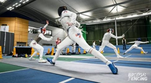
We spent time with photographer Richard Moran and some of the elite fencers at the Leon Paul Centre in North London – capturing the movements, actions and duels in beautifully original, authentic, high definition ways. In post-production, we then created a distinctive blue treatment for the backgrounds that worked to reinforce the Britishness and to accentuate the athletes in the composition.
The new brand also makes British Fencing a hugely attractive and enticing proposition for sponsors and partners alike.”